Haku Mule
Commission, September 2022
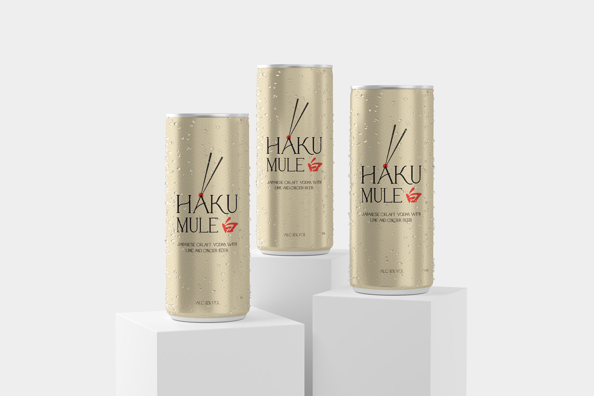
This project was commissioned for a limited supply run of a cocktail entered fora competition.
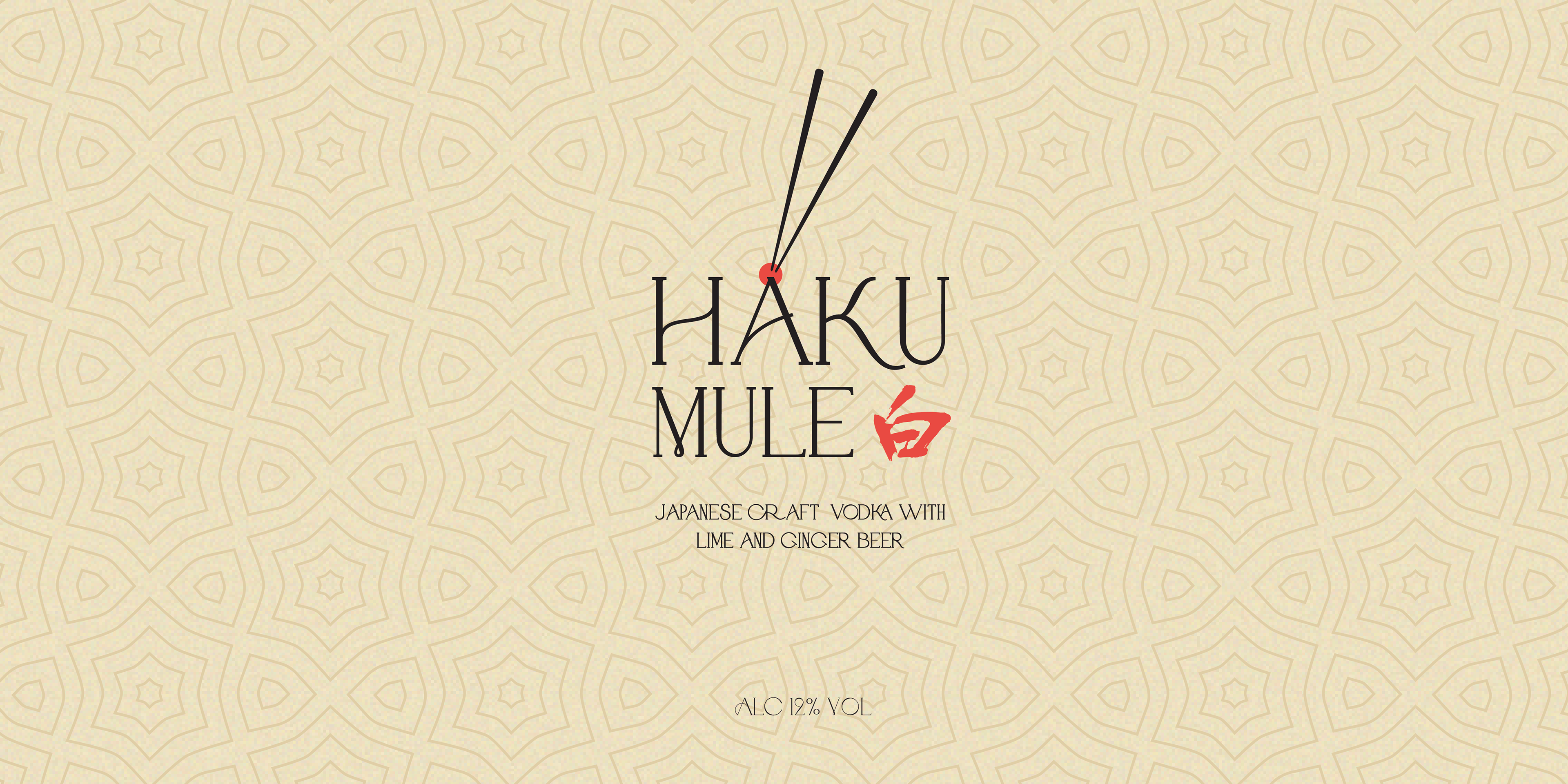
The client wanted the design of the can to use elements from the Haku Vodka bottle label, specifically the kanji (Japanese symbol) for Haku, as the Japanese rice vodka was one of the key ingredients for the cocktail.
Design Breakdown and Thought Process
Chopsticks are commonly associated with Japanese culture, which the client wanted the design to be grounded in. The cocktail was also to be served with pickled ginger, which would bring out the ginger beer flavour in the cocktail and compliment the rice vodka.
To help tie the chopsticks into the composition, the red circle sits at the top of the 'A'. The colour chosen was intentionally meant to resemble the red-pink colour of pickled ginger, whilst also complimenting the background colours.
The use of a pattern in the background is meant to echo traditional Japanese design and architecture, which makes use of elegant textures and patterns. A simple noise was applied to the base colour to break it up from the pattern and give it more texture.


